Modern data visualization impresses me. It's so darn elegant and appealing. So much to look at. It also befuddles me. It is incredible, the lengths information designers and the graphics desks at news organizations will go to these days to avoid using simple graphics like bar charts. And the graphics that replace them are so strange that I find myself wondering whether even the authors can make sense of their own designs, whether someone could quiz them on the data and they'd be able to use their own graphics to answer those questions.
I'm not so sure.
Pointless pictures
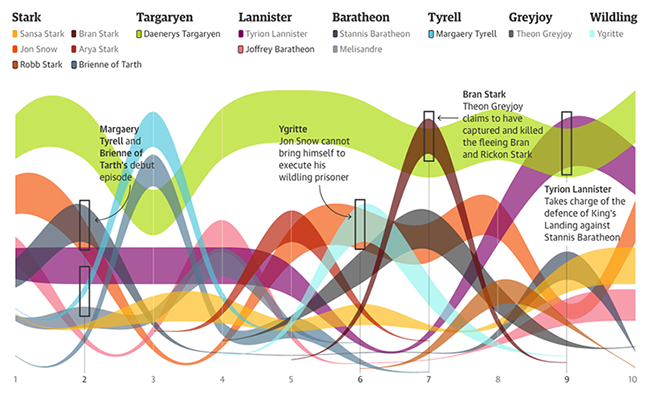
Above is a graphic showing the most searched for Game of Thrones characters throughout the airing of a new season.
Stacked charts are universally horrible and flow maps with a wasted Y-axis are possibly worse. This graphic is a combination of two very bad ideas, and it takes a long time to parse. Lines are going all over the place without discernible meaning. The legend is so expansive that it is impossible to keep the colors in working memory, meaning you continually have to dart back and forth between legend and graphic to make sense of what you're seeing. But most of all there is simply no point to graphing this information.
An episode-per-episode highlight would be a much quicker way to convey what characters the Game of Thrones audience was looking for and why.
Episode 7: Bran Stark Everyone googled for Bran Stark, because we'd heard in this episode that he supposedly was captured and killed... but wait, wasn't he still alive?
It also doesn't take a visualization to point out that Tyrion Lannister got a ton of searches throughout the season, because he's awesome, as did Daenerys Targaryen, because dragons.
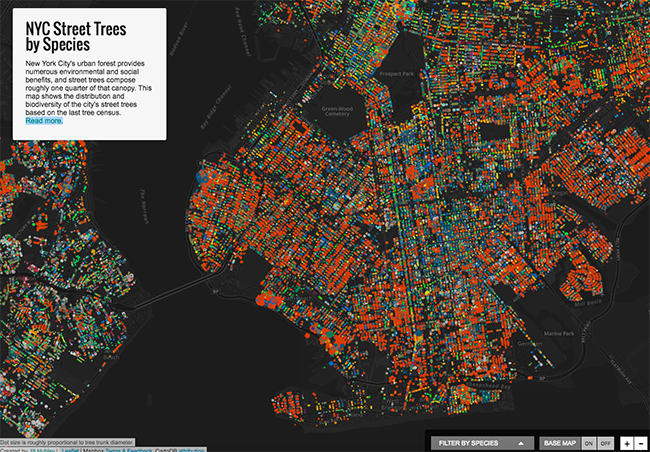
This is a pretty visualization of the trees lining the streets of New York City.
Maps are troublesome in general because you have to interpret distances and densities as both statistical and geographical information, and it gets confusing. Here, the bigger problem is that the map doesn't actually answer any of the questions we might like to ask of the underlying dataset.
- Which neighborhood is greenest?
- Which areas have the most diverse plantings of trees?
- What does a Norway maple actually look like?
A lot of data has a geographical component but that in itself is not sufficient reason to put the data on a map.
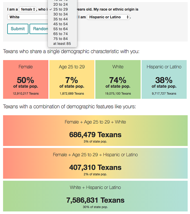
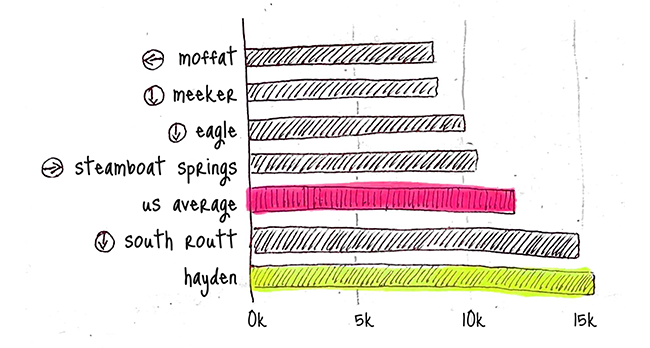
In contrast, How Many Texans Resemble You? published by the Texas Tribune in 2015 is elegant and informative. With hardly any effort you can see how many Texans share your age, gender, race and so on. Everybody understands percentages, no work wasted on a visualization that would only make things more confusing.
Kitchen sink visualization
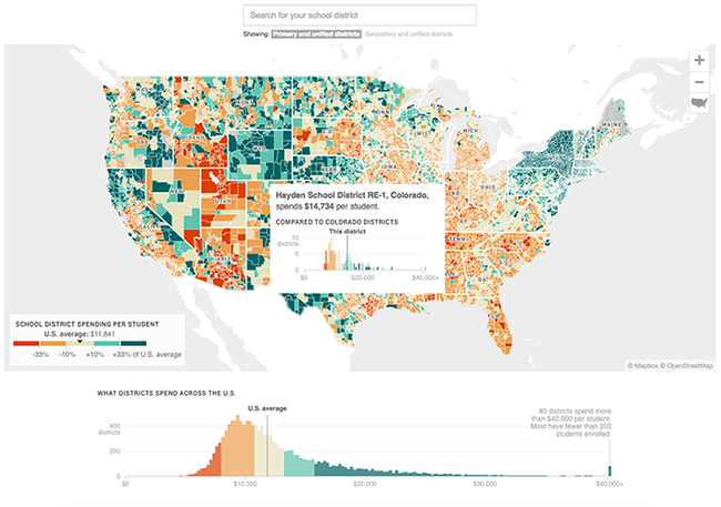
This map shows a statistic in a histogram in a choropleth in an article. Whoah.
Anyway, the map is about school funding. In the state of New York schools look pretty well funded whereas the south looks bad, but that's about all you can tell at a glance. It's not clear whether the graphic factors in cost of living, so who knows what any of this really means.
There's no story. Without a story, without knowing why you are visualizing a particular dataset, you also cannot know what to put in and what to leave out. The result is visualizations that include absolutely everything, to their detriment.
Most people, I'm guessing, would just want to look at their own school district and what's nearby -- and to be fair the interactive from which this graphic was lifted does include a search bar to do exactly that. The authors might have made it even easier on themselves by substituting a bar chart, which has the additional advantage of being much more precise than the four or five colors of a choropleth.
In interactive media, there's a very thin line between (a) showing respect for the intelligence of your audience by allowing them to explore the data and draw their own conclusions and (b) lazy visualization, because you can't be bothered to look for what is really the story behind the data.
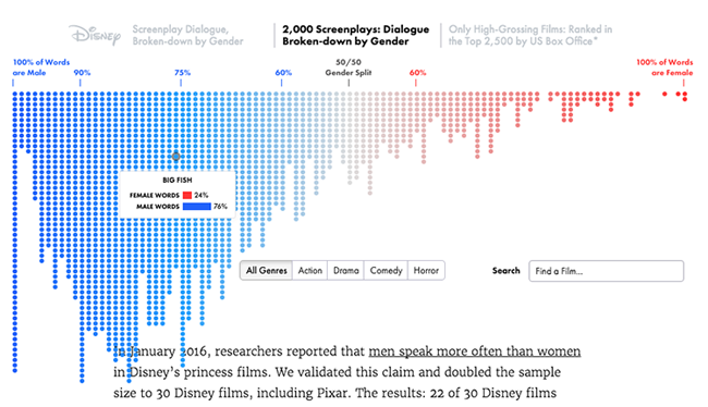
Women hardly speak in movies. It's true. This is histogram composed out of a lot of little dots, with each dot representing a different movie.
This histogram is just one of a number of different graphs exploring the gender imbalance in Hollywood movie scripts and overall it's a pretty wonderful browsing experience. You can see they put a lot of effort into getting the details just right. Sadly, for all this detail, we cannot actually compare anything to anything else. To compare action movies to comedies, we have to switch back and forth and back and forth and hope the afterimage is enough for our brains to merge the charts together. Assuming you can mentally realign the shifting vertical axis, that is. Bret Victor refers to this as a peephole: the reader can only see one slice of the data at a time and so "must beg the graphic for every scrap of information."
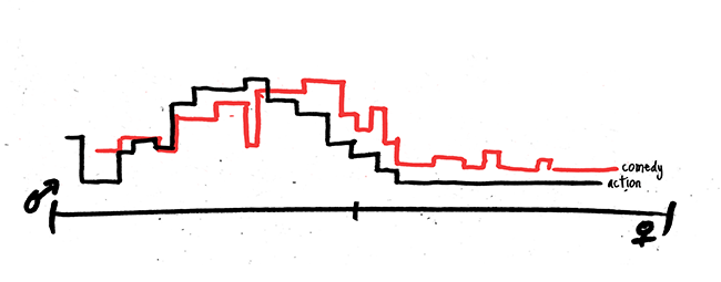
Switch to a simple overlay of histograms, and instantly it becomes clear that action movies are very male, that comedies sometimes have a better gender balance but that regardless of genre, dialogue still skews male.
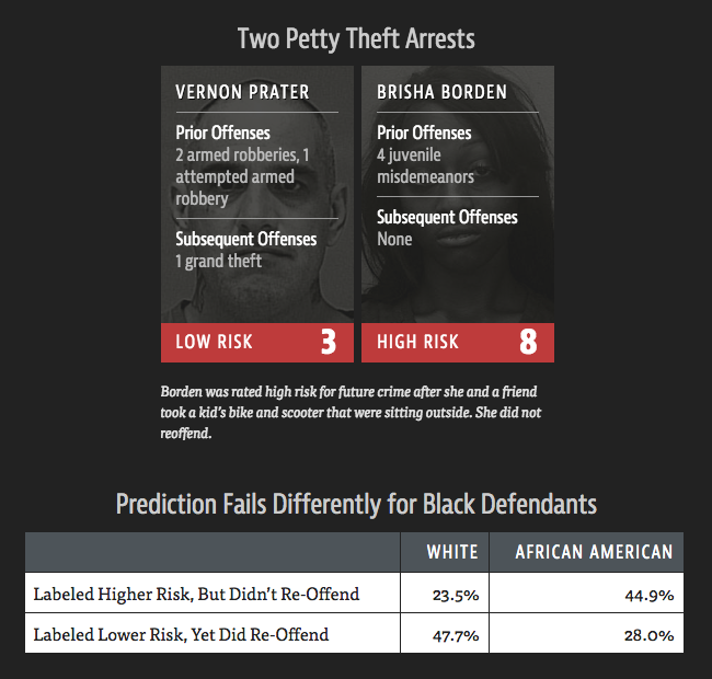
ProPublica's investigation into a biased algorithm that affects criminal sentencing is an example of how to do it right. In Machine Bias the authors condense an entire statistical analysis down to the one comparison that really matters. Abstract concepts like "low risk" and "high risk" are illustrated with examples. Charts when you need them, tables and text when you don't.
Higher dimensions
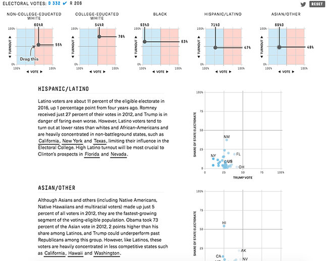
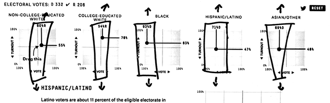
Elections depend on voter turnout and voter preference: it's better to have 60% of the Hispanic vote if almost all Hispanics show up to vote than to have 90% of the Hispanic vote if they all stay at home on election day.
This screenshot is from a wonderful interactive published early October 2016 where you can tweak exactly those two things, voter turnout and voter preference, and see how they could change (have changed) the 2016 U.S. presidential elections. Unfortunately, in practice, it's a lot for a reader to wrap their head around. You control turnout and voter preference and you get to do this for each group of voters concurrently.
I get that the interaction between turnout and preference is kind of the whole point of the calculator, but why not start with a single facet and work your way up from there? What happens, say, when black people vote less or more often?
Instead, we are forced to choose between an experience that is entirely on rails (read the article and glance at the graphs without changing them) and an unguided sandbox (move around preference and turnout arbitrarily and for every bloc of voters simultaneously, with everything affecting everything else.) It would have been nice to have a level of engagement in between let me tell you and just figure it all out by yourself.
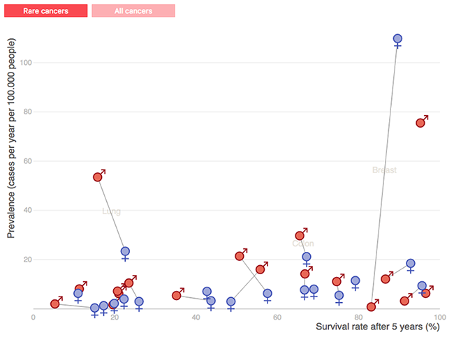
Some cancers are common and others are rare; some hit men harder than women; some have really low odds of survival but for others we're making good progress.
This chart displays different kinds of cancer, their prevalence, survival rates and gender disparities. If you've ever wondered what a four-dimensional graphic might look like, now you know.
Dimensionality is the primary tool to visualize relationships between variables -- for example, when plotted, highly correlated data points approximate a line. However, the relationships in this cancer chart are either too obvious or too complex to chart. Too obvious: men can't die from cancer of the uterus, common cancers get more research money so survival rates are often better. Too complex: men have lower odds of surviving most kinds of cancer because they exhibit riskier behaviors (more of them smoke, and when they smoke they smoke more than women), because there are fewer screening regimes and for a whole host of other reasons that would each need their own graphic if we really wanted to get into it.
When relationships between different quantities are not the main message of a graphic, it is better to show multiple graphs in lower dimensions, sequentially or in a grid. Simple two-dimensional graphs are easier to understand and the pixels you save by projecting everything into hyperspace is just not worth the cognitive load it imposes on a reader.
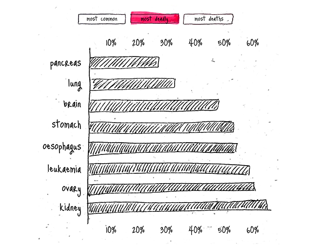
For this cancer graphic it's easy enough to split things up. Show the most common, most deadly, most deaths. (Sharks are more deadly, car accidents cause more deaths.) Show the kinds of cancer with the biggest gender disparities in survival rates. Four questions, four answers, four graphs.
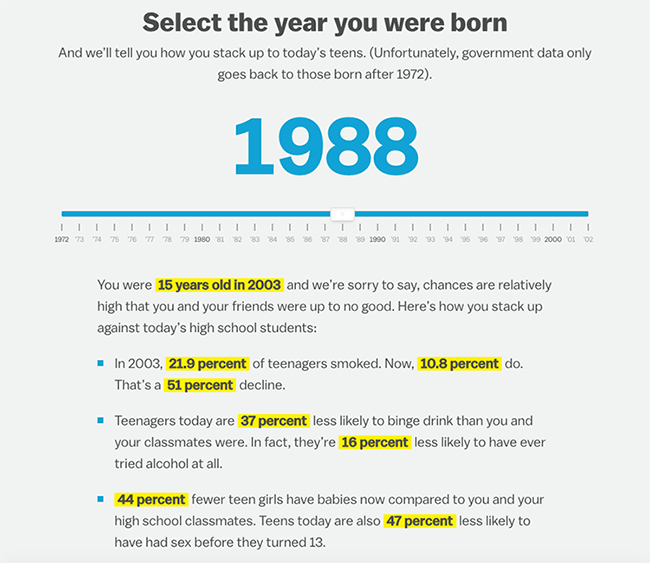
An example of an interactive that avoids heaping dimension upon dimension and keeps the focus on one particular issue is Vox's Today's teens are better than you, and we can prove it. By asking your age they can compare today's teenagers to your teenage years. Each factor, like smoking, unprotected sex and agression is then considered sequentially. A little bit of interactivity goes a long way.
Different for the heck of it
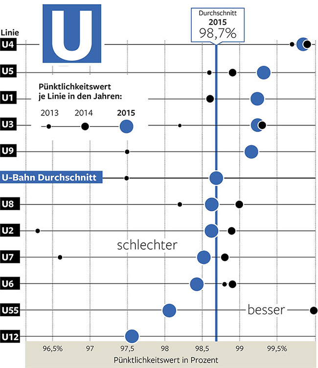
In Berlin, some metro lines are more punctual than others. This visualization shows the percentage of trains that were on time in 2014, 2015 and 2016. Different-sized dots represent different years. Sounds simple enough, looks simple enough, but try this: grab a piece of paper and time yourself while you write down which metro lines got better in 2016 and which metro lines got worse. Observe how long it took you to do this; did you notice the cognitive strain and your eyes darting all over the place?
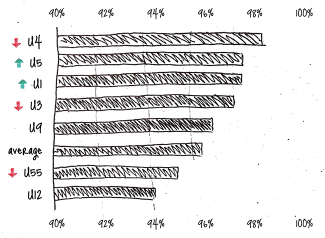
Instead, what if you just graphed the 2016 data, and then included a little up or down arrow to indicate whether the line had become more or less reliable? You're throwing away a bunch of information, but the main message pops: which lines are getting better and which lines are most reliable.
If you can't use a bar chart, the problem is usually that you're trying to show too much.
(Because I know you will ask: not having 0 on the x-axis here is perfectly acceptable. Every graphic must make a trade-off between emphasizing similarities and differences.)
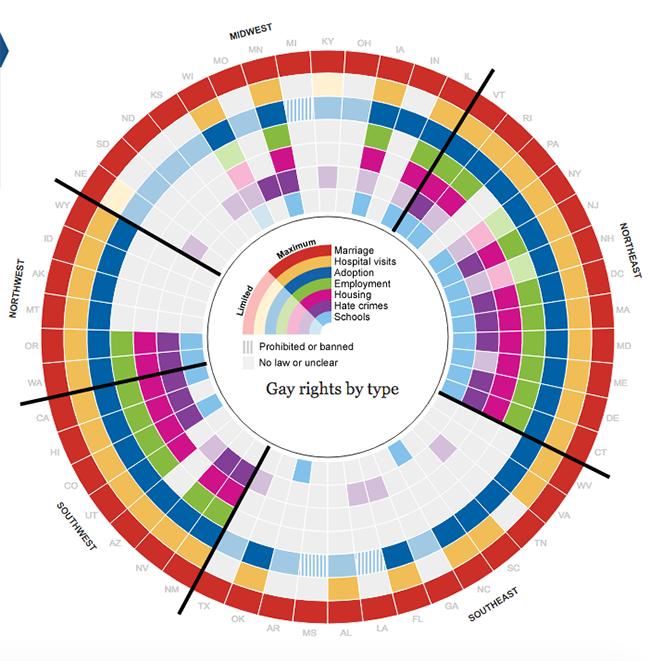
This graphic shows gay rights in all of the U.S. in 2012, right after gay marriage was declared legal in all states by the Supreme Court.
The grayed out squares indicate that there's no law about a particular area of concern or that the law is unclear, the colored squares indicate that a law protecting gay rights in this area is in force. A hatched square therefore means that, um, some progress is being made or that a law is in the works? Nope, it actually means the state has a law that specifically takes rights away from LGBTs. Strange choice, but nevermind, I am mostly interested in the weird design of the graphic itself.
The problem is that you can't scan concentric circles. Moreover, you have to keep going back between the legend and the bands of the circle. It looks cool but functionally it fails.
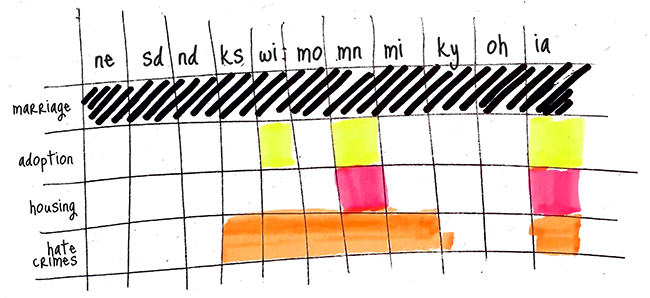
There exists another display of data, though, that does take advantage of the fact that we read from left to right and from top to bottom. Moreover, this alternative kind of display leverages our ability to quickly scan and skim text to allow us to quickly scan and skim data, too. It is known as a table.
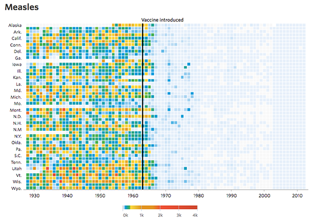
There are times when visualization that looks and feels different really does help to tell a story. I like this Wall Street Journal visualization from 2015 showing the massive drop in infections for measles, polio and smallpox after vaccines protecting against these diseases were introduced: Battling Infectious Diseases in the 20th Century: The Impact of Vaccines.
It would have been fine to just compare cases five years before and five years after the introduction of a vaccine, two simple numbers put in contrast, or a simple bar chart could have been effective too. But blowing up the data, showing that the pattern repeats in literally every state and for every new vaccine is what makes the whole thing so wonderfully in your face.
Don't try so hard
Each of the previous visualizations and the journalism that accompanies it is impressive in some way and I like a lot of the details, such as how the U-Bahn graphic includes the average as a reference point, how the cancer graph neatly distinguishes between prevalence and survival rates, how the election turnout graphs clarify the meaning of the horizontal axis with a blue and red background.
But each of these visualizations also tries too hard -- save for the counterexamples from ProPublica, Vox and WSJ, of course. Some use graphics where text will do, some buck convention for no discernible reason, some include the kitchen sink instead of making a point.
There's this old joke saying to never give an engineer information designer an easy job: they will turn it into a grand challenge just to keep things interesting.
There's a time and place for graphics that try to be fun or beautiful or weird and there's even a time and place for graphics that confuse their audience and make it struggle, on purpose. But it has to be on purpose.
When you're not sure what purpose a visualization serves, when you don't know whether you want to compare things or break things down or highlight one important fact, it might appear strangely logical to abuse lines, colors, space, time and every other visual signifier you can think of and create a kaleidoscopic ur-graphic, the graphic that within it contains the universe.
We might even come to believe that our byzantine graphic is the best possible representation of the data because it has been tailored, lovingly, to the quantitative geography before us. In reality, whatever objective advantage there might be to handcrafted visualizations is undone by the lack of familiarity the audience has with such displays. Learning how to read Cartesian graphs and bar charts is part of the middle school and high school curriculum in most countries; reading one-of-a-kind graphics is not. Bespoke graphics are like Dvorak, bar charts like QWERTY. You might not like it, but familiarity beats superiority.
And then if nobody understands our masterpiece we might say
- Oh really? It's perfectly clear to me.
- But it's supposed to be a challenge!
- You should think of it as art.
- It's an exploratory graphic, of course it doesn't have a "point".
Snap out of it. Consider my alternative.
Whenever you are working on a graphic, struggling to translate the numbers into a visual that makes sense, whenever you're convinced that a bar chart or a line chart couldn't possibly convey all of the nuance you have in mind, circle back to the question that prompted the graphic in the first place. Do not ask "How do I visualize this data?" but rather "What is interesting about this data, what questions do we wish to answer, what patterns do we aim to show?" Interesting questions lead to interesting visualizations. The resulting graphics will almost always be simpler, more focused.
But we'll bore our readers to death with all of these bar charts! Consider that you might be projecting your own predilection for the colorful and the complex onto your audience. It doesn't seem to bother the readers of Quartz and FiveThirtyEight, media with a more restrained approach to visualization.
Readers don't tend to ask seven-dimensional questions and the complexity and visual interest of a high-dimensional exploratory graphic only serves to draw our attention away from its ultimate lack of purpose.
I hate this genre of overwrought visualization not just because it is confusing, but also because if this is the first thing people think of when they think of visualization, if this is what wins the awards, we encourage practitioners to focus on design and technical wizardry at the expense of developing the statistical skills that are core to making meaningful graphics: understanding the data, questioning it, figuring out its shortcomings, exploring it, uncovering the salient points.
Focus on the data, focus on the questions you want answered. Once you've got that figured out, there is a lot of professional pride to be had in telling your story with a carefully crafted bar chart.
share on twitter
An ode to the bar chart debrouwere.org/6m by @stdbrouw
Stijn Debrouwere writes about statistics, computer code and the future of journalism. Used to work at the Guardian, Fusion and the Tow Center for Digital Journalism, now a data scientist for hire. Stijn is @stdbrouw on Twitter.