Navigation is a funny thing. How does your average newspaper carve its content at the joints? We’ll want a link to the latest news. Culture and entertainment also need their own homes, and so does international news. Perhaps a section with faits divers would be nice, for those readers who are just looking for something diverting. Video, too. Editorial and opinion pieces should be bunched together as well. The environment is a big topic nowadays. Hmm. Give that a section too.
Without knowing it, at this point we’ve constructed a navigation based on seven different criteria:
- genre: news, features, interviews, reviews, opinion pieces, satire, analysis, editorials
- theme: sport, culture, science, education, entertainment, politics, society
- subject (like a theme, but more narrow): environment, technology, higher education, media
- timing: breaking news, retrospectives, obituaries, history
- location: local, regional, national, international
- medium: written articles, audio, video, photography, infographics, interactive and multimedia journalism
- mood: news hot off the press, long and broad features, faits divers, thought-provoking reports, specials
If we focus on websites, we can add in two more:
- function, utility or presentation: news, community calendar, in your neighborhood, search, classifieds (and stuff like “login” and “contact us” that is functional too, but has little to do with the news)
- reader interaction: most actively shared, most e-mailed, most viewed, most commented on (although this is not entirely exclusive to the web: magazines sometimes have similar “in the news” sections)
But surely, my haphazardly cobbled-together scenario (hypothetical, to boot!) a few paragraphs upwards isn’t realistic? That’s not how you’d really split up a physical newspaper into sections! It’s not how you’d furnish the navigation of an online newspaper! It isn’t how these things actually look, is it?
A sampling
Bear with me for a moment, or scroll past these examples if they bore you.
Le Monde
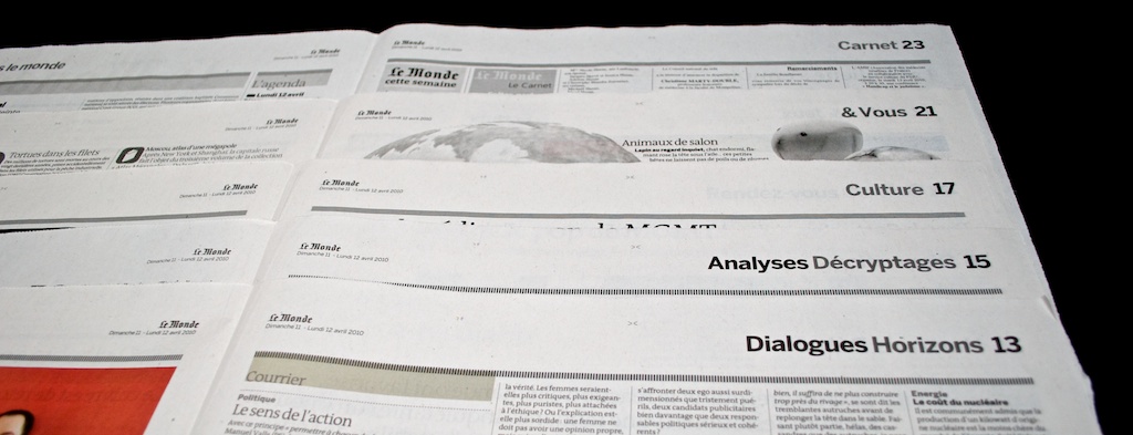
Le Monde — ah, my old college professors always tried to lure us poor students into reading this one, although none of us ever did. (It’s in French, nobody willingly reads French.)
Sections include the latest in international news, the environment, economics, news from France and analyses. Translated into criteria, I can spot timing, location, subject, theme and genre. They don’t really feel like sections, because they serve more as a soft introduction to what you can find on the page at hand, rather than as a way of dividing the paper into different parts. They also serve to indicate regular features.
The Observer
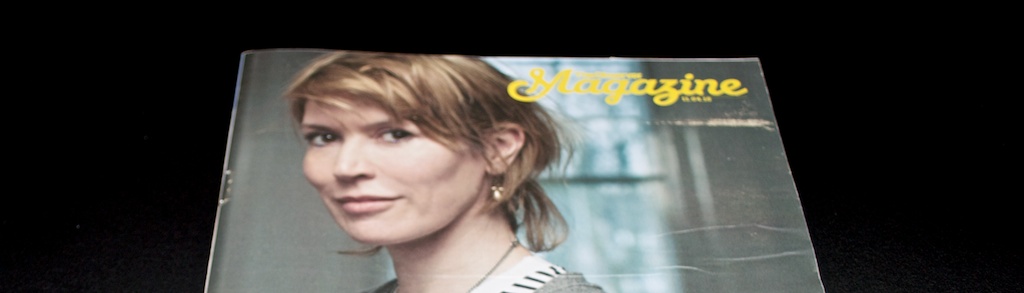
This is the international edition of The Observer for April 11th. The Observer is a sunday broadsheet from the UK. Lovely typography.
When I opened up the paper, The Observer Magazine fell out. Pushing content into different publications is of course the most visually obvious way one can split up content, achieving its intent by sheer physical separation. Magazines coupled to newspapers often contain longer features with less news value and often with more of a lifestyle kind of vibe to them — so newspaper magazines are often separated by mood from their host newspaper. And, if you allow me a bit of irreverence: they also uniquely harbor the genre of disguised marketing.
The newspaper itself is a big one as well, even taxonomy-wise. We’ve got subject and mood (an 8-page election special), timing and genre (news), location (world, Europe), theme (religion, culture, arts), genre and mood (comment, features, reportage). All mixed together. Feels very natural, though.
De Morgen
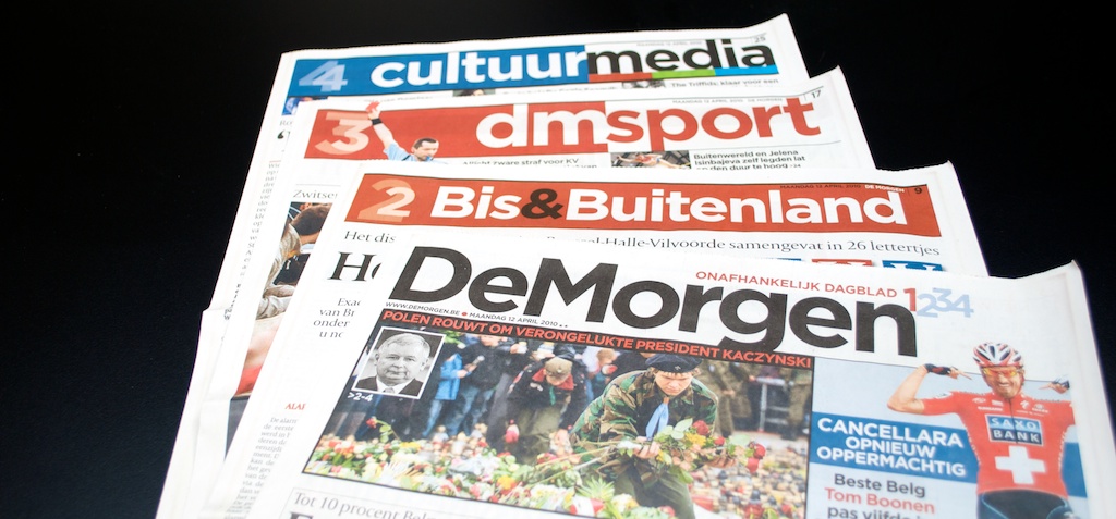
De Morgen is a Dutch-language newspaper here in Belgium. This weekday edition is divided into a common news-focused first part (mood, importance, timing), a section ‘more and international news’ (location and importance, or rather the lack of immediate importance), a sports section and one about culture and media (thematic).
This particular edition is taxonomically interesting for a lot of reasons. Because Lech Kaczynski, Poland’s president, had just died in an unfortunate plane crash, this particular piece of news is above the fold on the front page, even though there’s a dedicated section for international news the editors could have fit it in. Considering the importance of this Polish tragedy, it’s the obvious editorial choice to make, but it also constitutes, I believe, the only piece of international reporting in the frontmost section.
Another interesting aspect of the paper is that disparate sections (like media and culture) are bundled together not for any deep philosophical reasons, but because taken apart they’d only consist of a few articles each. Giving media and culture their own little individual section would look silly.
Sections in De Morgen show little taxonomic reasoning, but they’re quite sensible nonetheless. They show that there are a lot of factors we — consciously or unconsciously — take into consideration when deciding where in a newspaper to put something. This holds true online as well.
On to a few magazines.
Wired
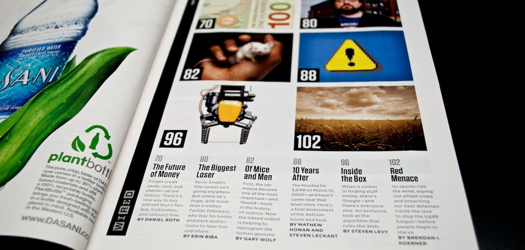
Okay, bad example. At Wired they just put all their content into a bag, shake it, and see how it comes out.
New Scientist
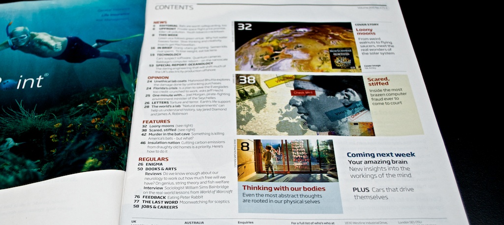
Probably the best science mag for laymen. New Scientist divides its content by a combination of genre (news, opinion), mood (news versus features) and function (regulars).
Finally, on to the websites, then.
guardian.co.uk
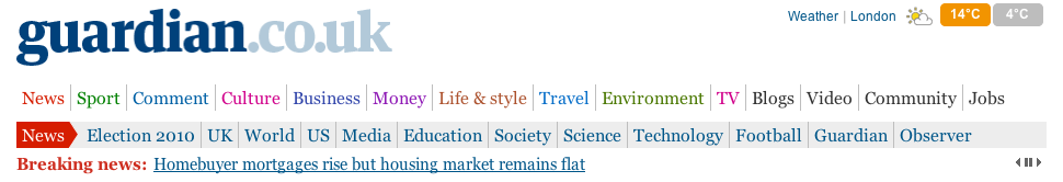
The Guardian is one of the few newspapers out there that really appreciate what keywording can do for them. Their navigation consists — uniquely so — of broad categories that bundle together more specific topics like technology, education, music, food and so on. It’s not perfect, but it’s pretty pure as these things go.
huffingtonpost.com

The HuffPo combines broad themes like politics, with narrower subjects like ‘green‘, adding links to location-based sections (N.Y., L.A., Chicago, Denver), and finishing things off with video, which is a reference to a medium, and bloggers, which is a reference to a genre. The functional links to the left (Facebook, twitter) are pretty prevalent as well.
Considering that the Huffington Post does quite a bit of A/B-testing, it wouldn’t surprise me if they’ve tested different incarnations of this navigation and checked how users reacted to them, resulting in a messy but perhaps effective amalgam. We shouldn’t prejudge these things.
chronicle.augusta.com

This newspaper is probably foreign to most readers, but The Augusta Chronicle is a nice and clean website for a local newspaper. Sports and business are thematic categories, but “Things to do” is as functional as it comes, and opinion is a genre.
These kind of menu structures makes me uncomfortable. On the one hand it seems like there’s no structure there at all, on the other hand these are exactly the kind of high-value destinations that are useful to me as a reader. If I’m a regular reader of the Chronicle, I’ll use the menu more like a bunch of shortcuts, not as the dividers in a catalog. It’s called navigation for a reason.
nytimes.com

The NYT cannot be absent from this bout of navigation staring. First up are a few location-based links, then mostly themes and subjects. Pretty consistent, although opinion (which is a genre) is randomly thrown somewhere in between. Also check out the links to video (medium), most popular (reader interaction) and times topics (presentation) on top.
lawrence.com
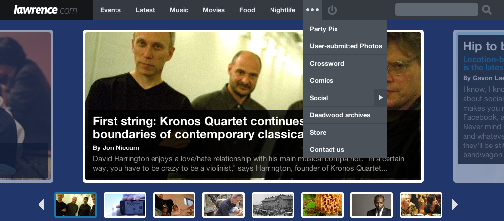
Lawrence.com is a very neat community-heavy site for the city of Lawrence, Kansas. Like many local ventures, they emphasize function: what can I do (events), what’s happening (latest), what can I eat (food) and where can I relax (nightlife)? Local newspapers and websites want to mean something to their readers, so the functional approach seems like the way to go.
We need the hodge-podge
Okay, enough pretty pictures for now. As should be obvious by now, yes, most newspapers and magazines, both off- and online, have sections that are a hodge-podge of different ways of organizing content, all thrown together and used alongside each other. Some are a bit more consistent than the others (lawrence.com is in large part functionally organized, guardian.co.uk on the other hand revolves around themes), but all of them try to serve their purpose as navigation, as tour guides to a website, and taxonomy comes second.
They’re not ideal. Readers need to be able to grasp in an instance what your magazine or newspaper site has to offer, but also how to get to the content they like. These are conflicting aims. But most newspapers try their best to find a golden mean.
Mixed-criteria navigation can be messy, but messy is the way it has to be. It’s tempting to put on a hero suit, storm the newsroom and tell the staff, “henceforth, our navigation will be thematic and thematic only.” Except I really do like the fact that most newspapers provide a quick link to their opinion pages — browsing by genre. And I plead guilty, sometimes I want to switch off my brain and peruse the ‘bizarre and strange’ section of my local newspaper — browsing by mood.
Purity is liable to make the navigation or sectioning in newspapers less useful, not more. And nine different navigational menus for our nine criteria — genre, theme, subject, timing, location, medium, mood, function, interaction — might well upset the delicate sensibilities of the graphical designer tasked with implementing such a scheme. (But I’d love to see someone give it a shot regardless, for experimentation’s sake.)
Navigation is volatile
Pulling off a good mixed-criteria navigation is tough. When designing a website, it’s also scary: once you’ve chosen a certain way of organizing content, you’re stuck with it. We didn’t use to have that problem. Sections in print require less forethought, because you can change them around every edition if you really must. Site sections, on the other hand, come with their own channel pages, their own archives and they serve as facets in our search engines. You’re stuck with them.
Changing your primary navigation thus means adjusting the category of every single story ever written to suit the new scheme. Want to split up your existing culture section into performing arts and book club? Economics into money, business and finance? Good luck.
Many newspapers have an environment section nowadays, but that’s a relatively new thing — the environment didn’t used to command our attention as much as it does at present. So most of these papers have their old stories about the environment catalogued under other headings like science. And that’s how these stories are still catalogued. Relabeling the entire science catalogue, or wherever these stories about the environment were filed, would take an inordinate amount of time. As time goes by and websites amass content, these inconsistencies will only get larger.
We become stuck with our legacy. We shouldn’t be.
Make primary navigation incidental to the stuff that matters
The main lesson I want you to carry away from this blogpost: make primary navigation incidental to fundamental properties inherent to your content, rather than basing them on editorial whim. We’re better off building our navigation algorithmically, using the basic elements of a story — its theme, its genre, its medium, the locations it talks about — as our building blocks.
Once we’ve decided how we want our primary navigation to look like, we need a dose of self-awareness. We need to think about the choices we’ve made and why we made them. We can gain that knowledge by asking one simple question of every section we’ve specified: which criteria form the basis on which to decide if something belongs to that section? The goal must be to take that decision once . Once you’ve ascertained the rules of thumb that would enable anyone who can read to catalogue your content, you’re well on your way to making navigation that you can mold to your every wish.
Here are a couple of examples that show how varied primary navigation can be, and how the rules behind them could look like:
- the music section: everything with
musicas a theme - latest and greatest: all recent content in the genre
reviews, with a score above 75% and ten responses by readers, unless the review is less than a day old, in which case we’ll show it regardless of the amount of comments - “All eyes on the 2010 elections”: all video and photographs related to the event
2010 elections(either themselves or through the stories where these videos and pictures are included) - modern living : everything tagged
environmentandlifestyle - Child abuse in the Catholic church (special) : every story related to the organization
Catcholic churchthat haschild abuseas a theme
Some of these sections, like the last one about child abuse in the Catholic church, are fleeting. They may need to become part of the primary navigation (or be otherwise put in the spotlight) at the moment they’re hot topics, and silently disappear or be repurposed as topical pages when the dust settles down. If we want to be on top of the news, we need to be able to assemble this kind of ad-hoc navigation quickly and effortlessly, not by asking an editor to skim through the entire archive, hand-picking stories that might be relevant for these special dossiers.
The section in which we put a story should be based on the fundamental properties of those stories, rather than on the whim or intuition of an editor. We decide once how we want to split up our content, and from that point on, a computer should be able to do it.
Of course, we actually need those fundamental properties available to us for a computer to be able to take over the curation of our primary sections. That’s bound to be a challenge for most newspapers, especially if they have existing content that lacks this structure and information, or a CMS that can’t adapt to these challenges. All I can say is: it’s worth it now. And it will become more than just worth it, the longer you’ve been doing it.
Editors shouldn’t waste time deciding in which section to put an article — those sections are fleeting, they’ll change anyway — but they should take the time to codify the stuff that matters: its genre, its themes, the location or locations to which a piece is tied, its importance, perhaps its mood.
An example. If you’ve read Tags don’t cut it you know of the cool things you can do if you specify the relationships between a story and the locations it talks about in a machine-readable way. It’s but a small step, and an automated step at that, knowing that the primary location for a story is somewhere in Ivory Coast, to catalogue that article under international news. You can even make topical pages per continent or per country if international reporting is your forte.
Often, the rules that couple fundamental metadata about articles to a section will be trivial. A lot of sections will map pretty directly to themes — music, culture, politics — so if you have a well-maintained tagging system in place, constructing most of your navigation should be a breeze.
But don’t just think that you’ll want to store fundamental metadata like themes and genres and so forth just because they can be useful in constructing a future-proof navigation. You’ll find that a lot of other of these fundamental properties have their own uses and deserve to be part of your content management system on their own accord. We’ll talk more about that in next week’s post.

The primary channels that comprise a newswebsite are equal parts taxonomy, marketing and vision. The way we structure a news website isn’t just a matter of creating a tidy little storehouse of news, it should be part of a larger content strategy, in line with our journalistic ambitions. Our menus should be able to change when our vision changes, our ways of organizing our content should be able to adapt to the future as readily as we do.
Don’t stop at primary navigation: the more, the merrier
There’s one other point I’d like to address. Primary navigation on a website is of necessity a one-size-fits-all solution. It has to be everything to everybody. It has to show what your website is about from the first moment the page loads. But there are so many lovely ways of browsing content.
- I very rarely search for books on Amazon, I search for book lists that were made by other users, and use those to explore new stuff I might like to read.
- The New York Times’ Custom Times Feeds allow me to follow just those topics I’m interested in.
- On Delicious, I often glance at the websites people in my network have bookmarked.
- Some people aren’t looking for anything in particular and love a little randomness.
We might not have a lot of space above the fold. We need to treat the header of our website carefully. But apart from that, the web provides the perfect medium to make all of these alternative ways of navigating a site available to readers. These don’t have to be everything to everyone, but can mean a lot to some people some of the time, which is just as important.
If your content has a lot of metadata associated with it — its genre, its mood, its length, the amount of comments, associated themes, medium — such information can serve a bigger purpose than just being part of the equation in generating a primary navigation. Metadata can serve as facets when searching, and it can serve to easily create all kinds of secondary navigation, allowing readers to explore your website just the way they want to.


The metadata that will serve us so well in constructing a dynamic navigation, will happily serve to create complementary ways of browsing as well. Take that opportunity with both hands. Your readers will thank you for it.
share on twitter
Navigation headaches debrouwere.org/1e by @stdbrouw
Stijn Debrouwere writes about statistics, computer code and the future of journalism. Used to work at the Guardian, Fusion and the Tow Center for Digital Journalism, now a data scientist for hire. Stijn is @stdbrouw on Twitter.